Mercury by Hope Larson
Summary: In 2009 Tara is living with extended family after her and her mother's ancestral home burned down. In 1859 Josey is living in said home and her family is being tempted with the promise of a gold mine on their property. Since if there's one thing this family needs, and wants, in both time periods it's money yet this gold may bring more problems than it solves.
The Good: While The Sight (not that the book ever explicitly names it as much) feels a bit gimmicky in Tara's story I liked how it was integrated into Josey's, actually I liked Josey's story more than Tara's in the end since it felt a little more complete and the character's seemed a tad more fleshed out. Although I do wish the story had been able to expand on the other supernatural elements that popped up later, they're so brief that I do wish the story had either expanded on them or just left them out all together (which would have been worse since they then pop up again in Tara's story).
The Bad: Both of the halves in this book, the past and the present are perfectly fine stories with beginnings, middles, and ends yet I just don't think they work that well together. Either story could have easily stood on it's own yet putting them together hasn't given Mercury any deeper meaning or made it structurally any better. In the end I wish that the story had chosen to focus on just one story instead and gone a bit deeper, such as Tara's relationship with her mother which I felt was so superficial that I had a hard time believing it was even causing conflict. Finally, I found it rather odd that the story needed to have so many asterisks for Canadian slang instead of just putting them in a glossary or simply taking them out. Just about all of them I would have been able to figure out through the dialogue anyway and it was more distracting than useful to see "loonie* *a one dollar coin is called a loonie for the loon on the back" instead of just "dollar" or even "loonie, you can pay me back".
The Art: I'm starting to realize that I'm just not as fond of the stark, black and white only with thick outlines style of art I've been coming across a lot lately since I just find it a little boring and, well, I don't want to read boring looking comic books. That aside, I also found the paneling layout a bit boring as well since it only uses rectangles and squares and I don't recall it even making the squares larger or smaller for dramatic effect. I read a lot of manga and webcomics where the creators go wild and try all kinds of layouts to get the look they want and while not everyone does that I seem to find more people in those two mediums than I do in US/Canadian produced comics which puzzles me since plenty of those webcomic artists are in the US/Canada. So in the end, while the art was solid and I could certainly follow the flow of the story it just didn't interest me and that's bad when something that's literally half of the story bores me.
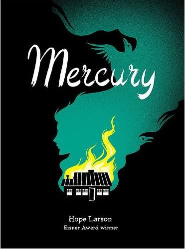
In the end I can only give this 2.5 out of 5 stars and raised eyebrows over the fact that the cover proclaims that this was an Eisner Award Winner. While certainly not terrible I just didn't see anything in the story that I thought would elevate it up to what I would expect out of an Eisner winner, makes me wonder what the other nominees were that year (2010 I believe).